Real Estate Marketing & Beyond
Heat maps are ideal tools for representing data visually. This makes it easier to examine and analyse the content. Maps created out of excel data are the perfect way to marry the mass of numbers you have on a spreadsheet with the ability to quickly digest and comprehend what those numbers are saying to you. The question is, what is the best way to represent the information you need? There are several types of heat maps, and they all serve a different purpose for analyzing your marketing data to strategize next steps.
A heat map provides you with a visual representation of data. When it comes to marketing and your website, it can show you, in an easily digestible form, how users who visit your website behave once they are there. You can see where they click, where they click away, which pages hold interest for the longest, and several other behaviors that can help you plan your marketing content. Heat maps allow you and your marketing team to identify what works and what doesn’t, so that you can optimize your content to increase your conversions. You can even perform A/B testing on the elements of your website, and overlay the data that comes from that testing on a heat map. This will give you a quick representation and allow you to analyze and share that data easily and efficiently.
Heat maps provide digital stories about what your visitors are doing when they land on your website. However, there are several ways to tell that story, and each way serves a specific function.
The purpose of a scroll map is to record how visitors scroll through your pages. Why is this useful? This data tells you when users are abandoning pages and moving on to other things. If key information is often below where your users are scrolling, then even though they are visiting the page, they might not be seeing or engaging with what you want them to. You can then adjust your page length to make sure that information will be consumed. Not only that, but if certain pages have a shorter scroll length than others, then there may be an issue with readability or functionality that is causing them to lose interest. A/B testing will help you figure out what the problem is, but you need to know there’s a problem before you can do that.
A report on what your visitors are clicking on, even if they are clicking on things that aren’t clickable, may seem like a futile endeavor. However, you can glean very valuable insights from this data. For instance, if you see on a page that has a high bounce rate that users are clicking on a component that is not clickable, or that they go to a certain spot first before the actual method of clicking through, then you know you have a problem. It’s like being a CSI agent and tracking how someone has moved through a room. If you see that users are clicking somewhere they can’t, then you can adjust your page design so that they can click on those elements so that they will convert and move through your website. The key is that you are finding out what is happening between the time a user hits your site and makes or doesn’t make a purchase.
A mouse tracking report can show you what users are doing with their mouse while they are on your website. Are people consistently hovering their mouse over a specific spot or page element? This can tell you what users find most interesting, and you can tailor your content to match that. However, sometimes people can hover their mouse over something, such as the headline, while still reading on.
Once you understand how to use a heat map and what benefits you can get from them, you need to figure out how to create them. With a great excel mapping software, it’s incredibly simple.
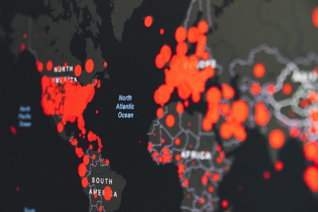
Heat maps are not just useful for your digital marketing needs. They can also be incredibly valuable for mapping out your top locations and areas where you have a strong customer base or have opportunities for growth. Management can compare their sales teams, and gain insight into customer behavior. With so many benefits, and the simplicity of use, there is no doubt that you can use heat maps to your advantage immediately to help you get the most out of your marketing budget and grow your business to newer heights.