Your real estate website’s homepage is critical for keeping traffic on the site and increasing the odds of converting that traffic into actual homebuyers. Along with dictating the flow of the site, a homepage’s main purpose is to give you an introduction to what your website is about as a whole, and of course to make a positive first impression on users who reach your page. But balancing an attractive look and feel, functionality, and a good user experience can often be challenging when determining how to build a real estate website or deciding which template to use.
After scanning the web for all different kinds of real estate websites, we were able to find more than a handful of real estate sites that offer brilliant homepage designs, which are sure to keep local home buyers in their area coming back. Some of these examples offer a great page flow on a clean, simply-built web platform, while others are designed specifically to give off that “wow” factor as soon as you lay eyes on it.
Once taking a look at each of the real estate websites we’ve listed, please remember there are thousands of real estate websites out there with awesome graphics, eye-catching features, and a generally smart layout. In other words, it’s impossible for us to list them all, so if you have a great real estate website with a top-notch homepage, we’d love to see it. Mention it below in our comments section and we’ll update our list in the coming weeks!
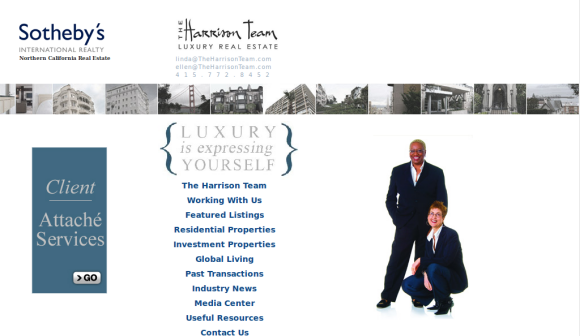
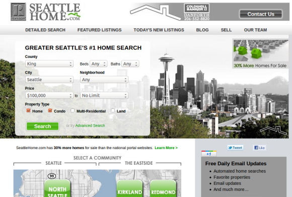
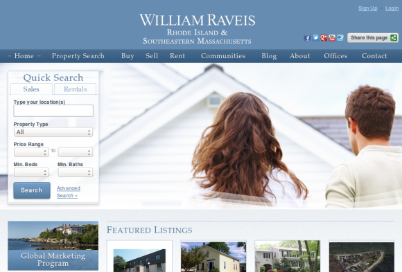
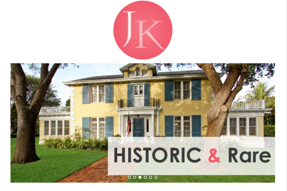
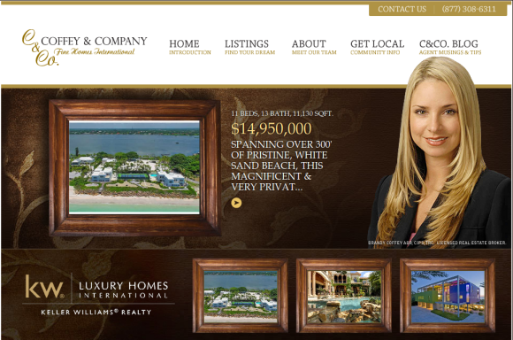
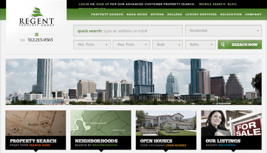
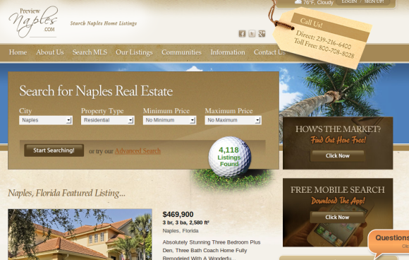
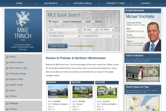
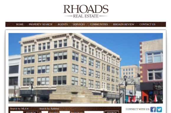
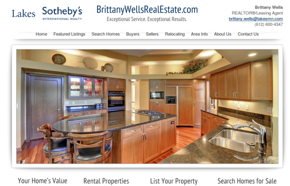
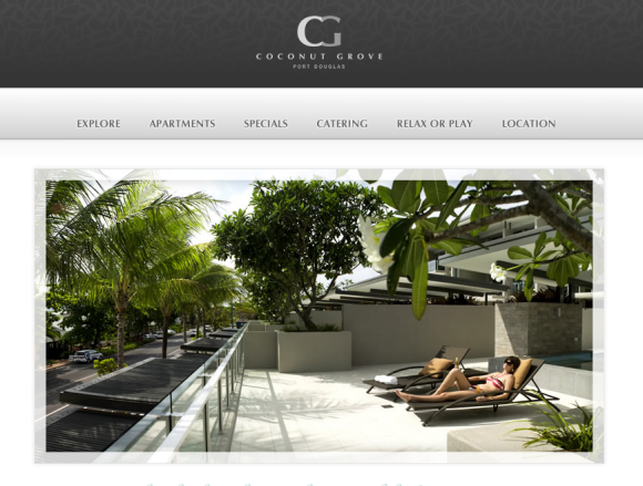
Wow this is a great list! I have been looking for a better real estate website. It seems the trend is to have a half-page image on the homepage as an attention grabber. This does help alot with my research.
Thanks for compiling. I'd humbly add http://www.planetpads.com to your list.